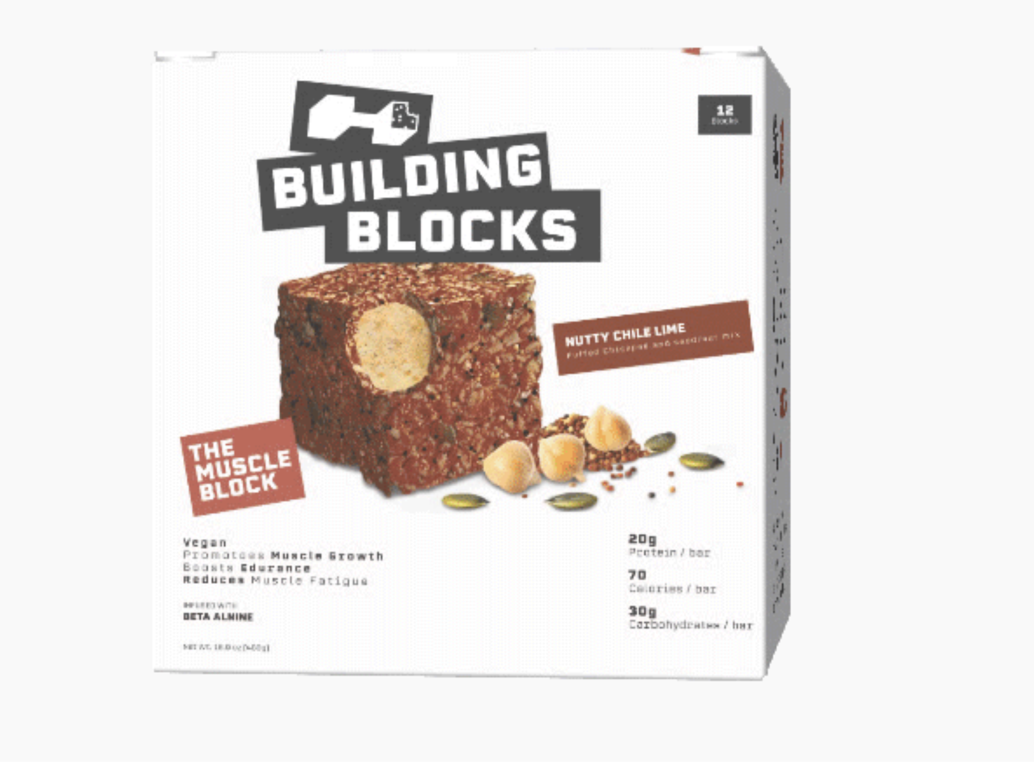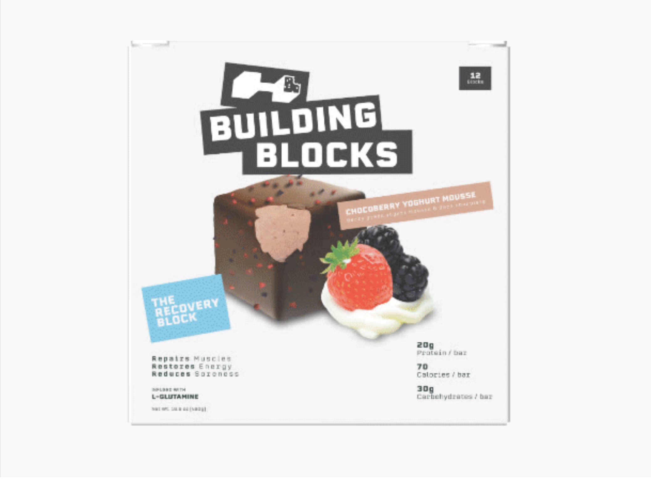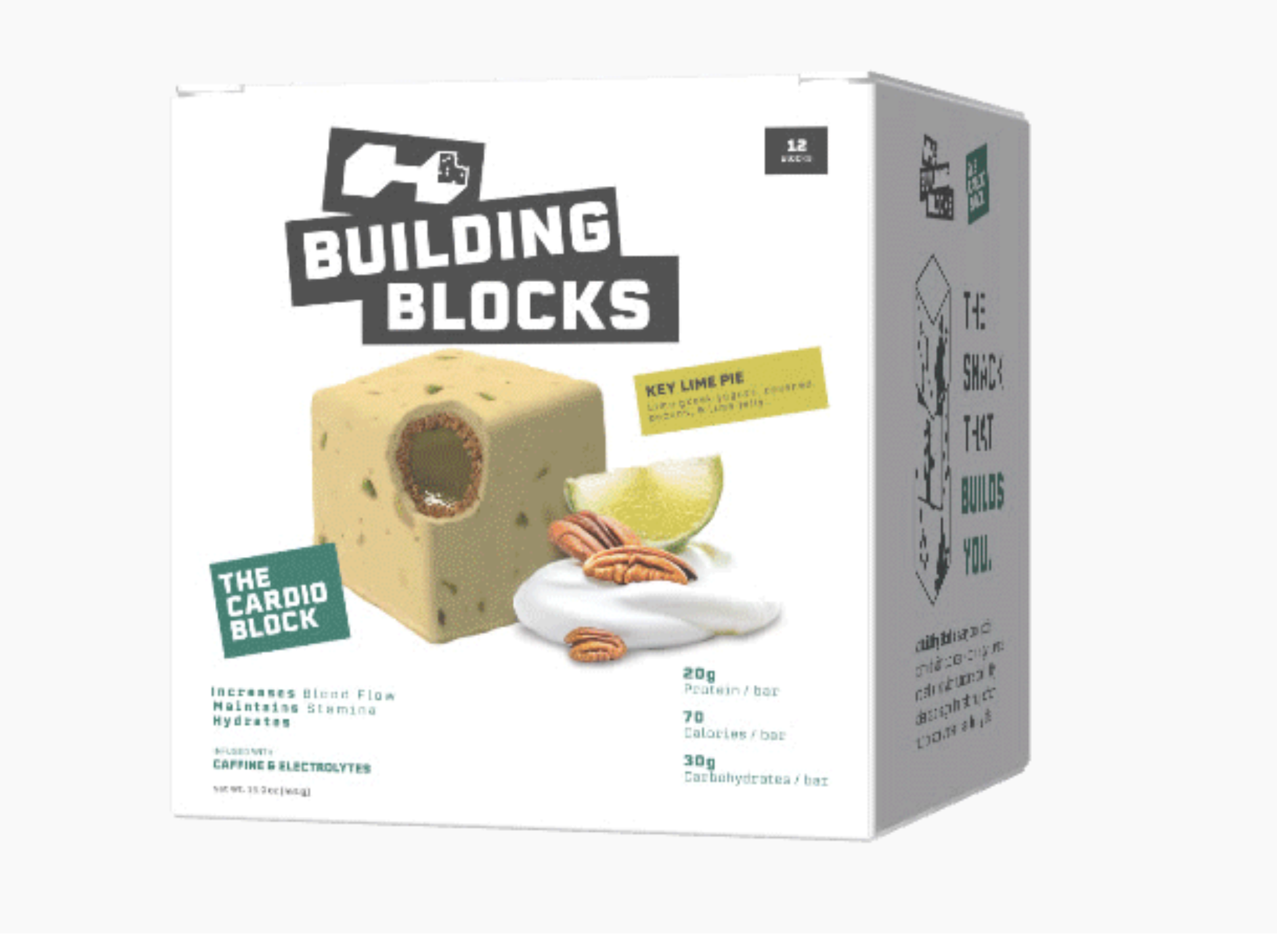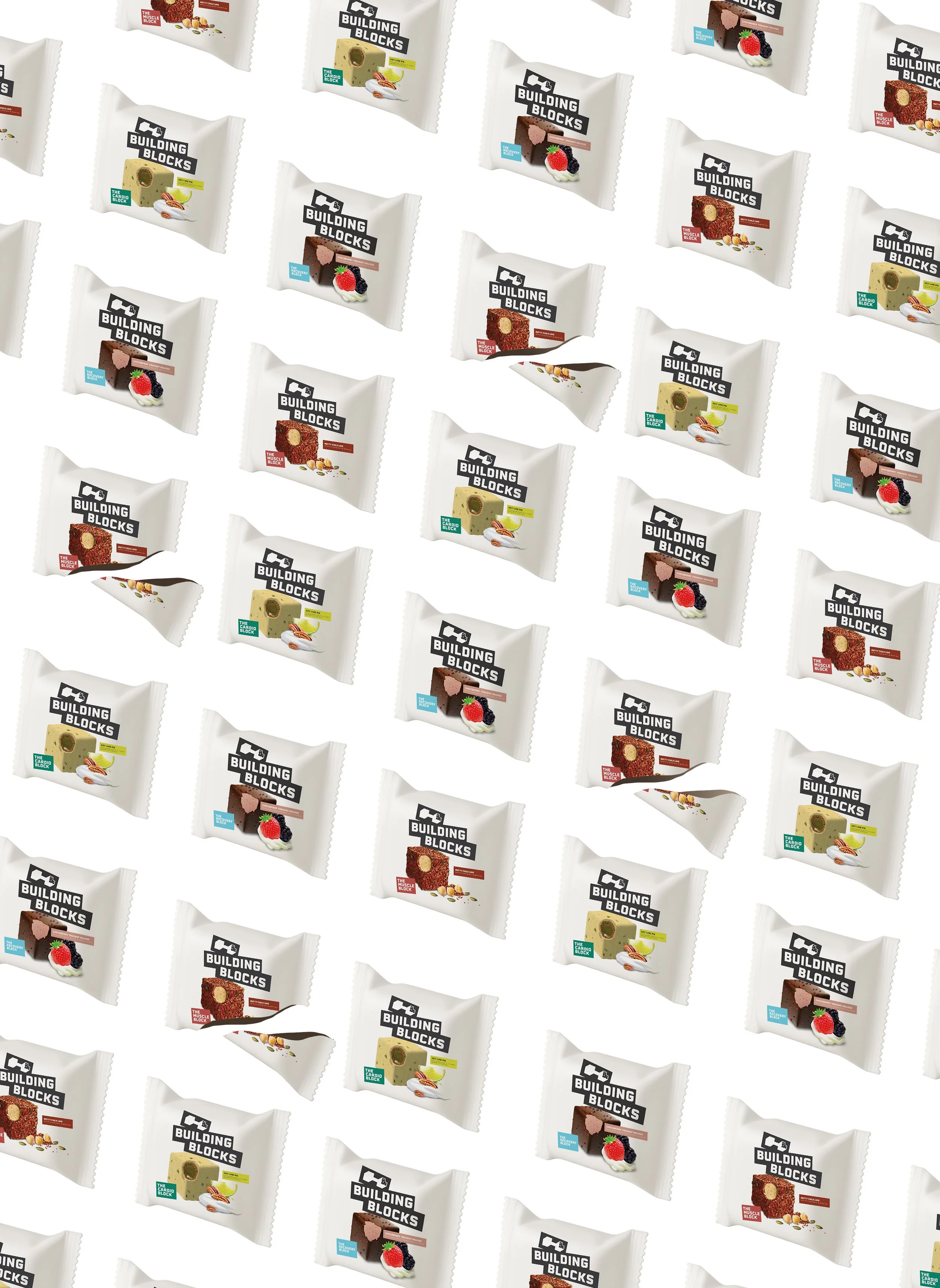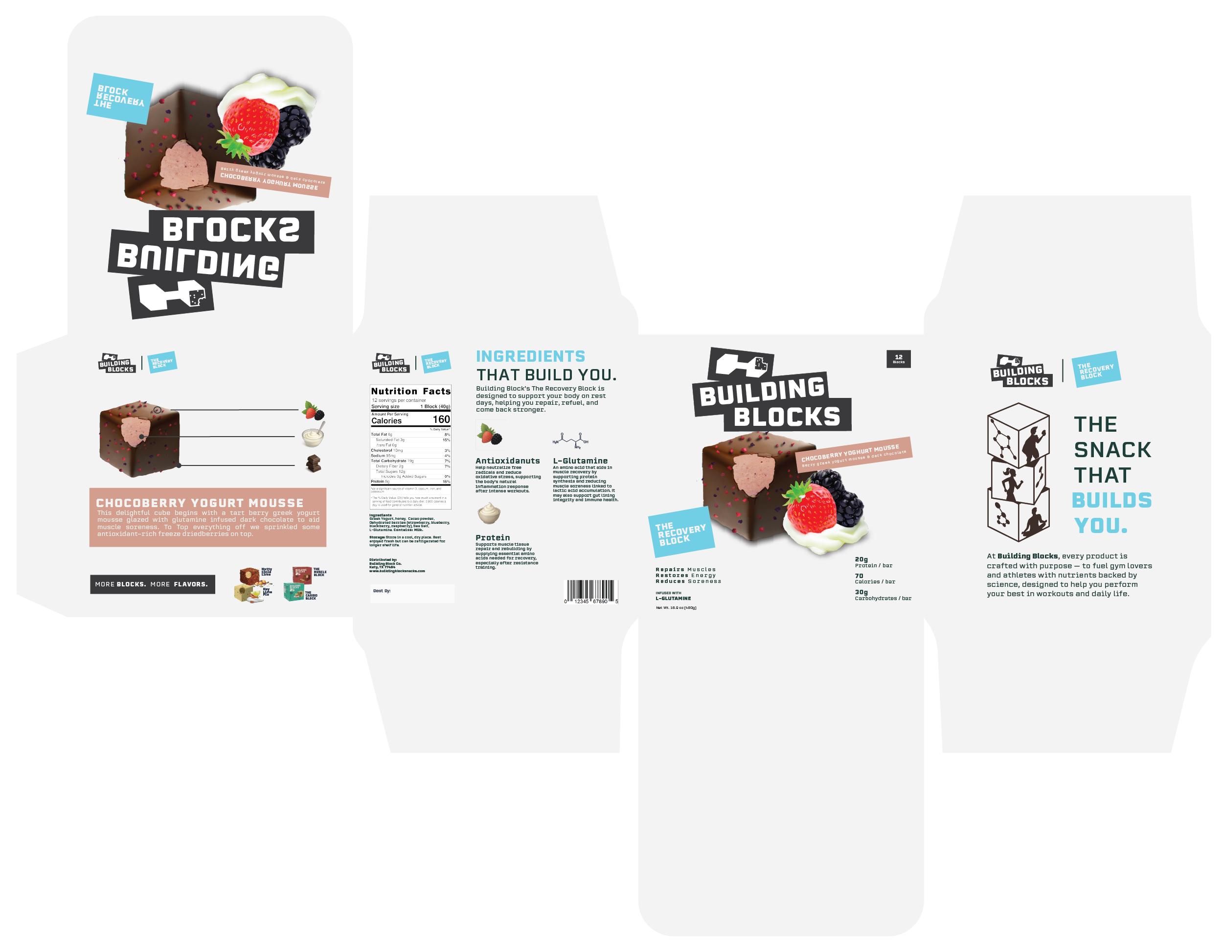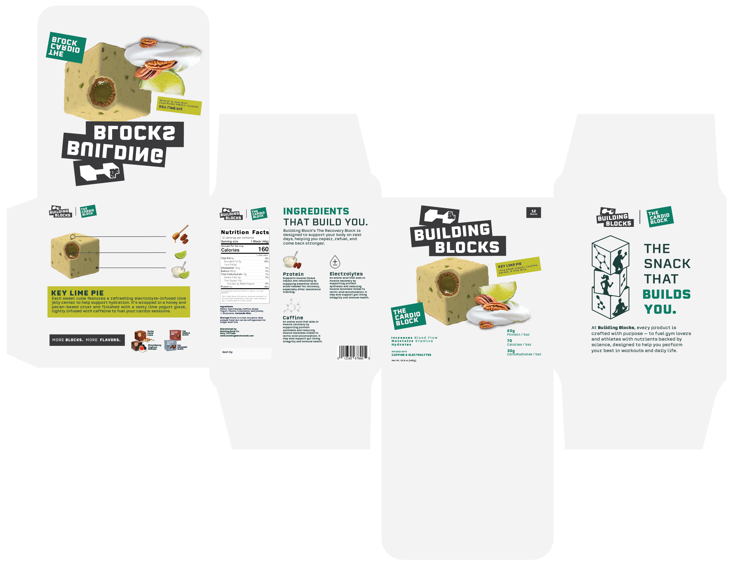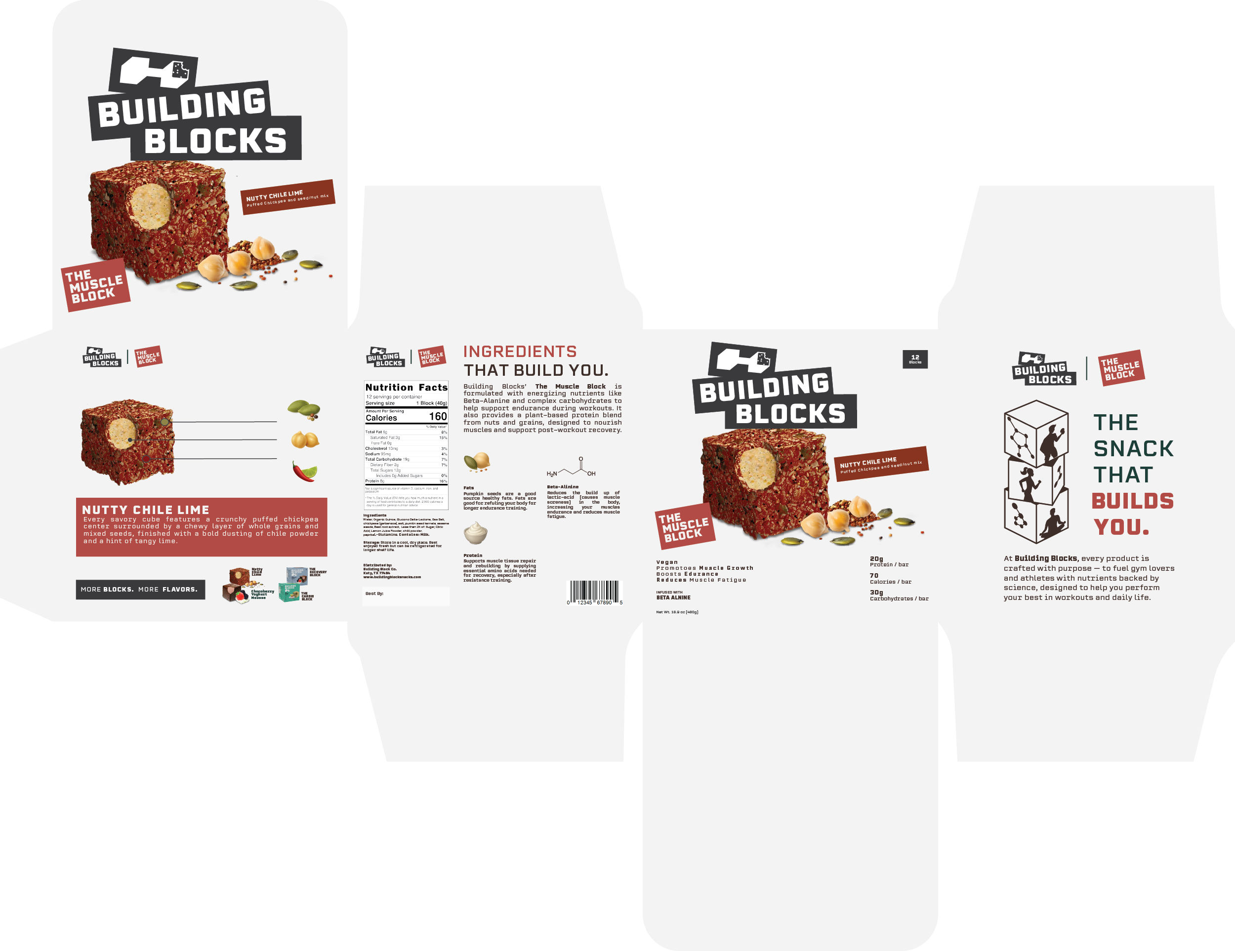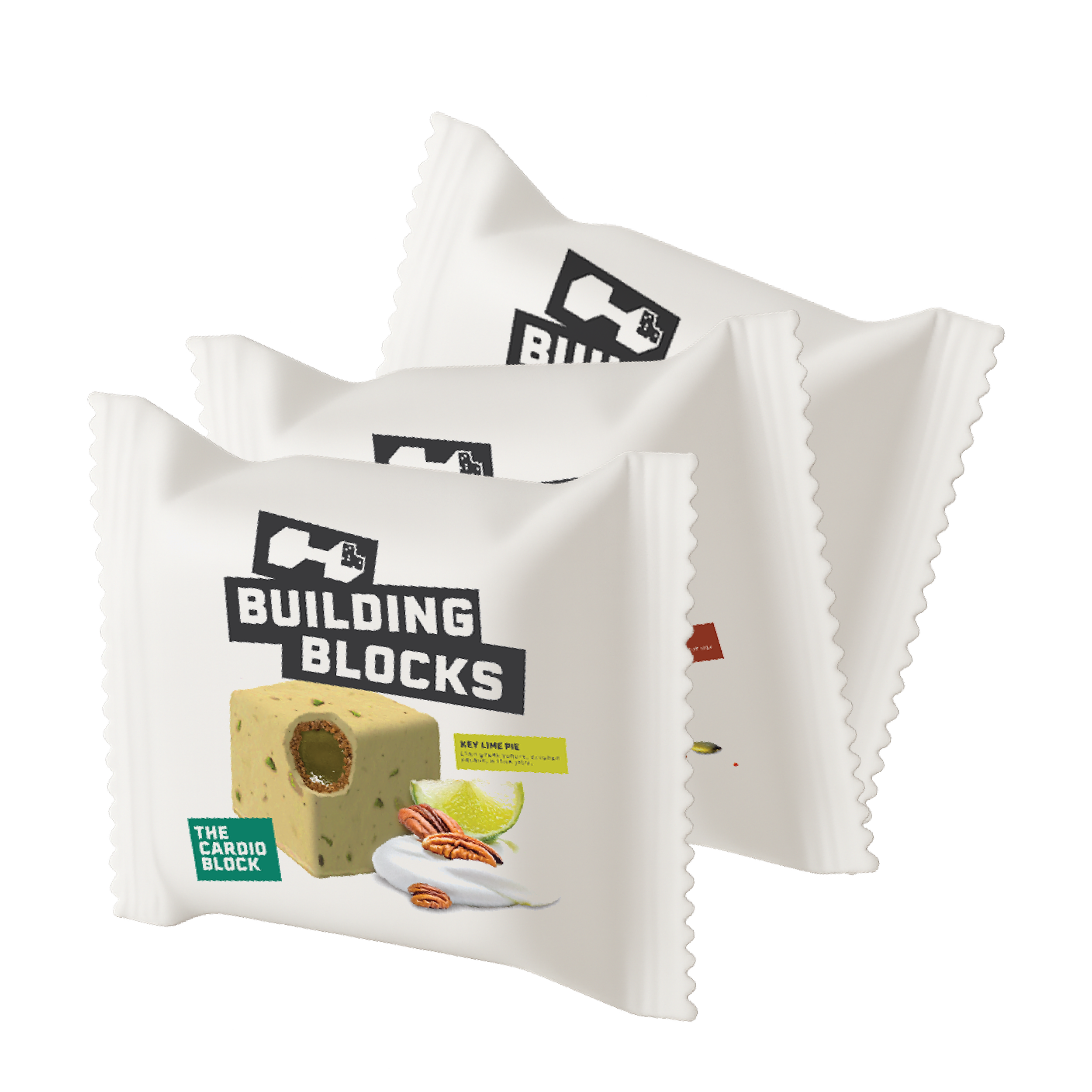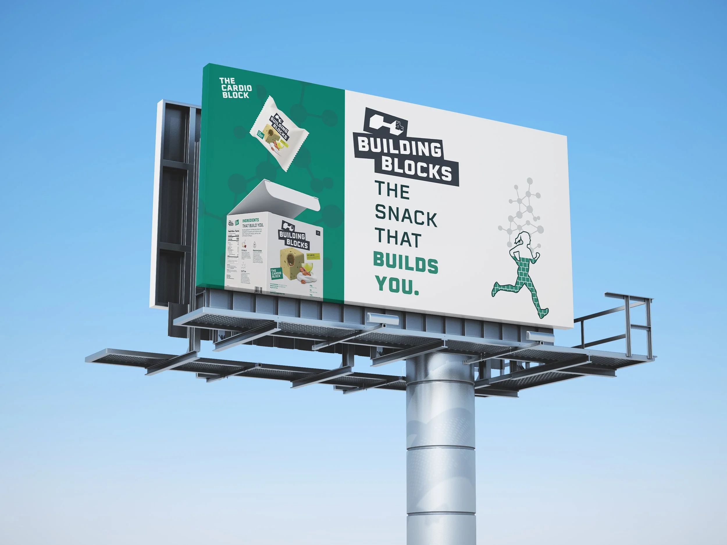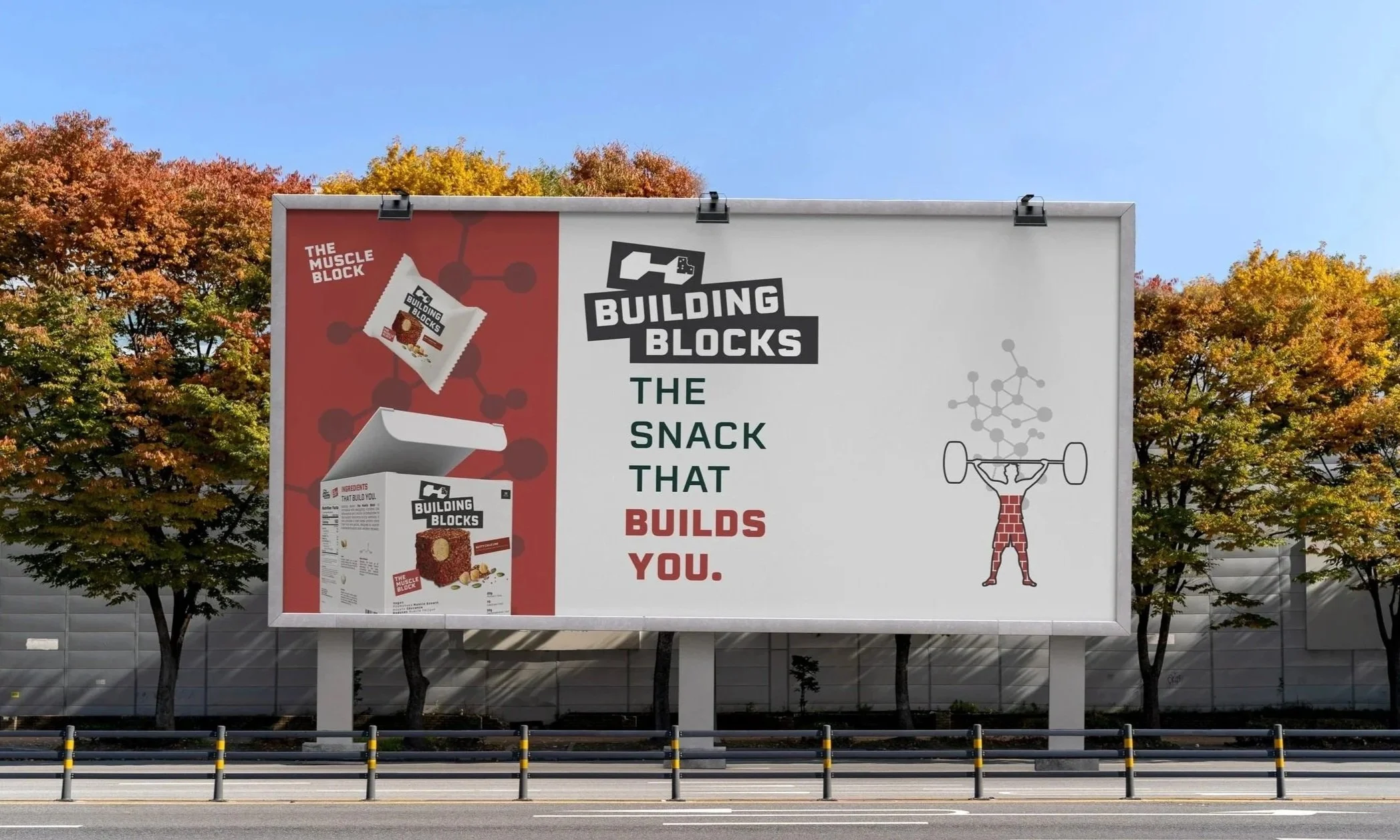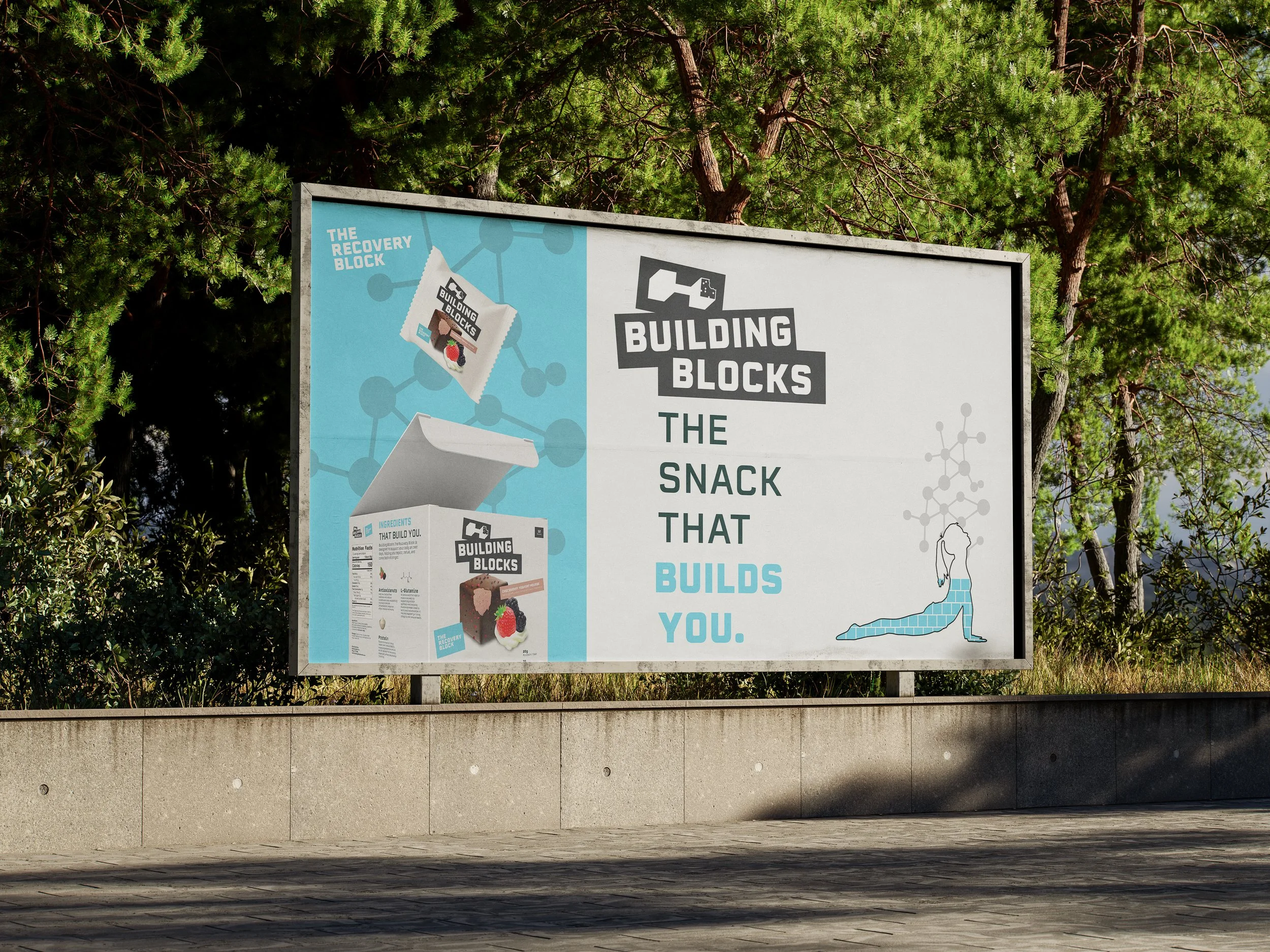
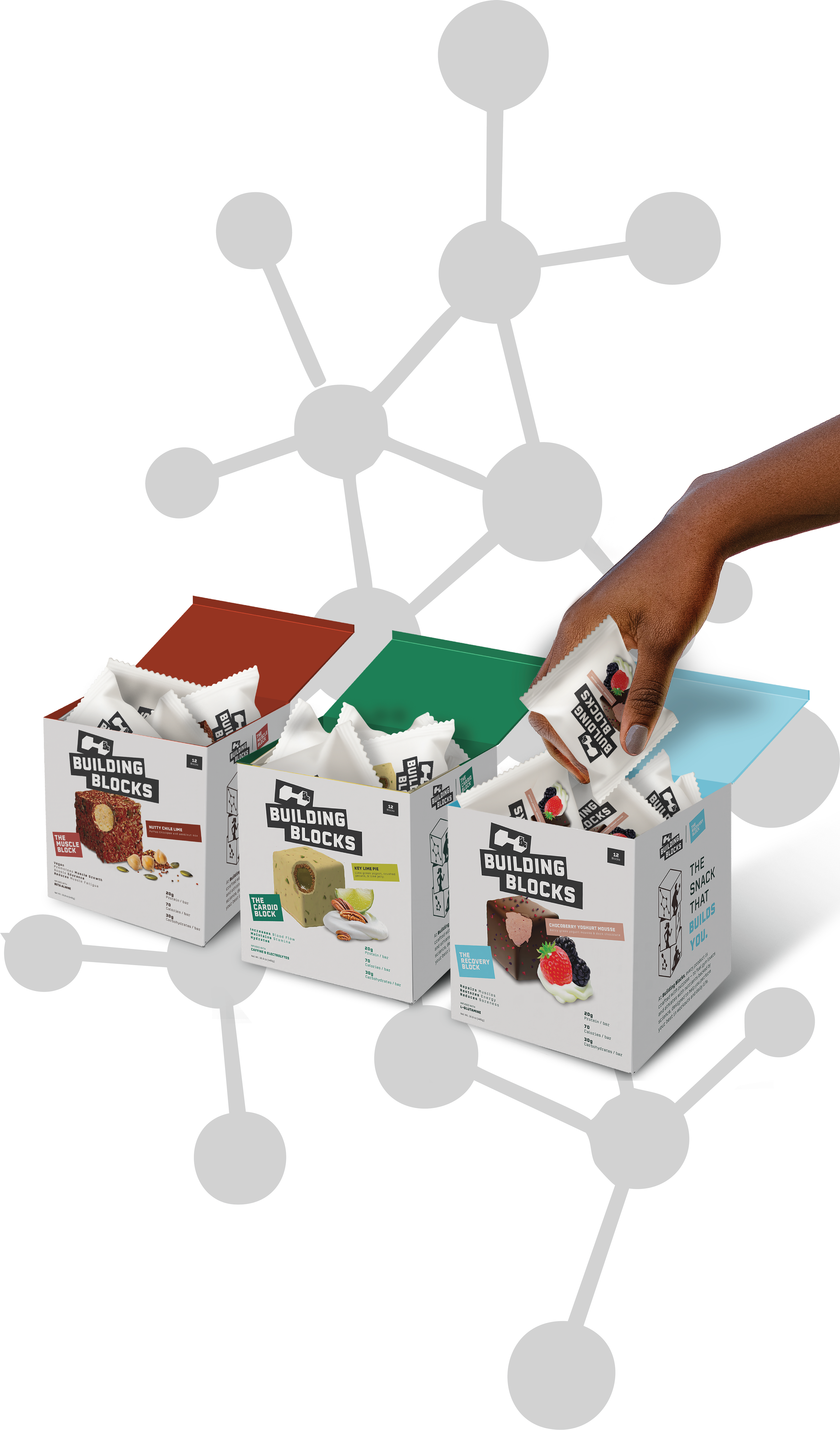
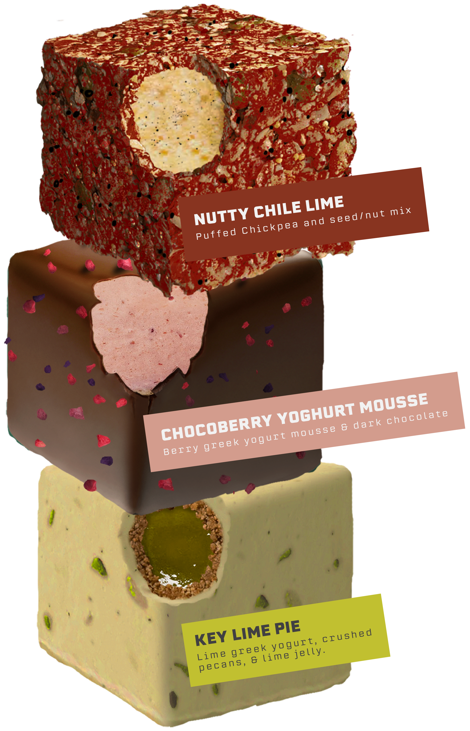
A functional snack brand created for fitness-conscious consumers who want snacks with a clear purpose. The product features cube-shaped bites designed to symbolize structure, strength, and progress. Each variety supports a different fitness goal, combining convenience with performance nutrition. The brand should feel bold, modern, and motivating.
Building Blocks
Logo Design,
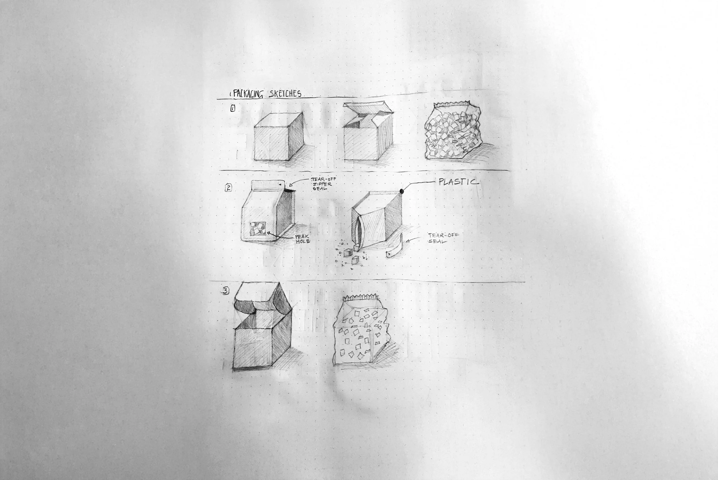
Packaging,
Product Line Design,
& Brand Identity
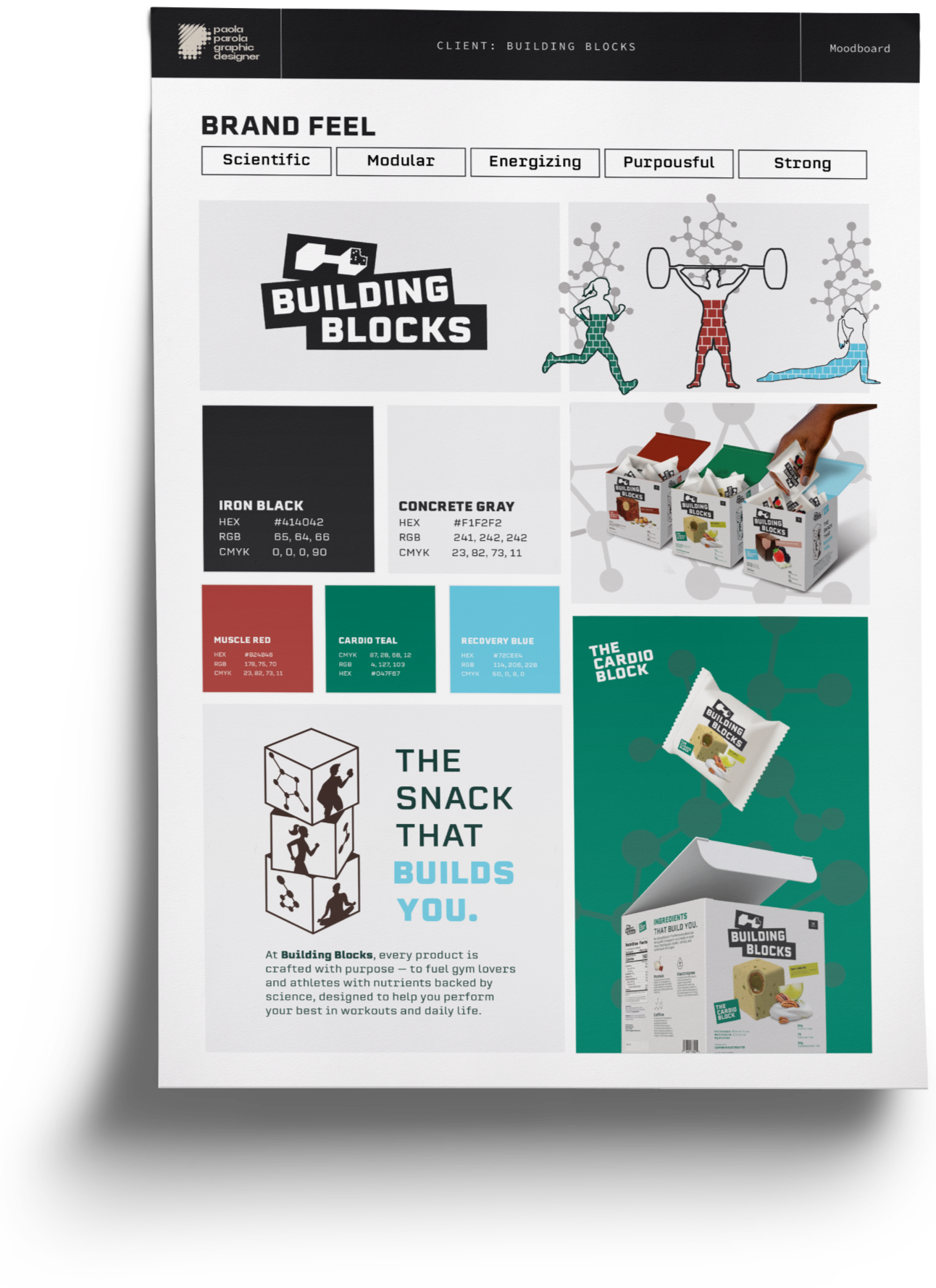
Develop a cohesive brand identity and packaging system that positions Building Blocks as a purposeful snack for active lifestyles. The brand should stand out in a crowded health snack market while clearly communicating function, energy, and results.
Client Objective
Building Blocks is a play on words that connects the product’s cube-shaped design with the science behind muscle growth. Protein is often called the building block of muscle because it helps repair and rebuild the body after exercise, making the name both literal and meaningful. This idea is reinforced through the logo’s bold, structured letterforms and geometric shapes, which visually communicate strength, stability, and the modular concept of building something stronger one block at a time.
Swipe across to rotate. Pinch to zoom.