Introduction
Tidy Tides: Eco Surf’s Grand Opening Campaign
Tidy Tides is a fictional campaign developed to simulate a real client brief for Eco Surf Repair Shop. The goal of the project was to build a surf shop brand from the ground up and extend it into marketing, advertising, and event collateral. The campaign explores how illustration, typography, and visual systems can work together to support brand awareness and community engagement. Each phase of the project builds on the previous one, mirroring a real-world design process from identity creation to promotion.
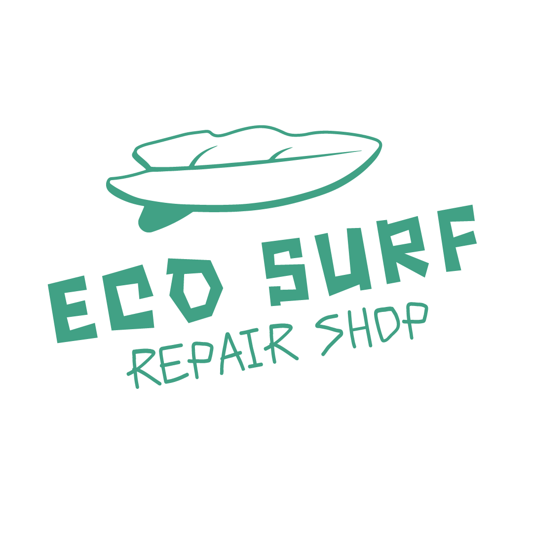
Logo Development
Creating Eco Surf’s Brand Identity
The logo design phase focused on establishing a clear purpose and target audience for Eco Surf Repair Shop before any marketing materials were created. Research into surf culture, sustainability, and local coastal communities informed extensive wordlists centered on audience and purpose. Symbol-combining techniques were used to merge visual ideas from both lists into a single, conceptual mark that represents eco-conscious surf repair. This identity became the foundation for all subsequent collateral, ensuring consistency across marketing and event materials.
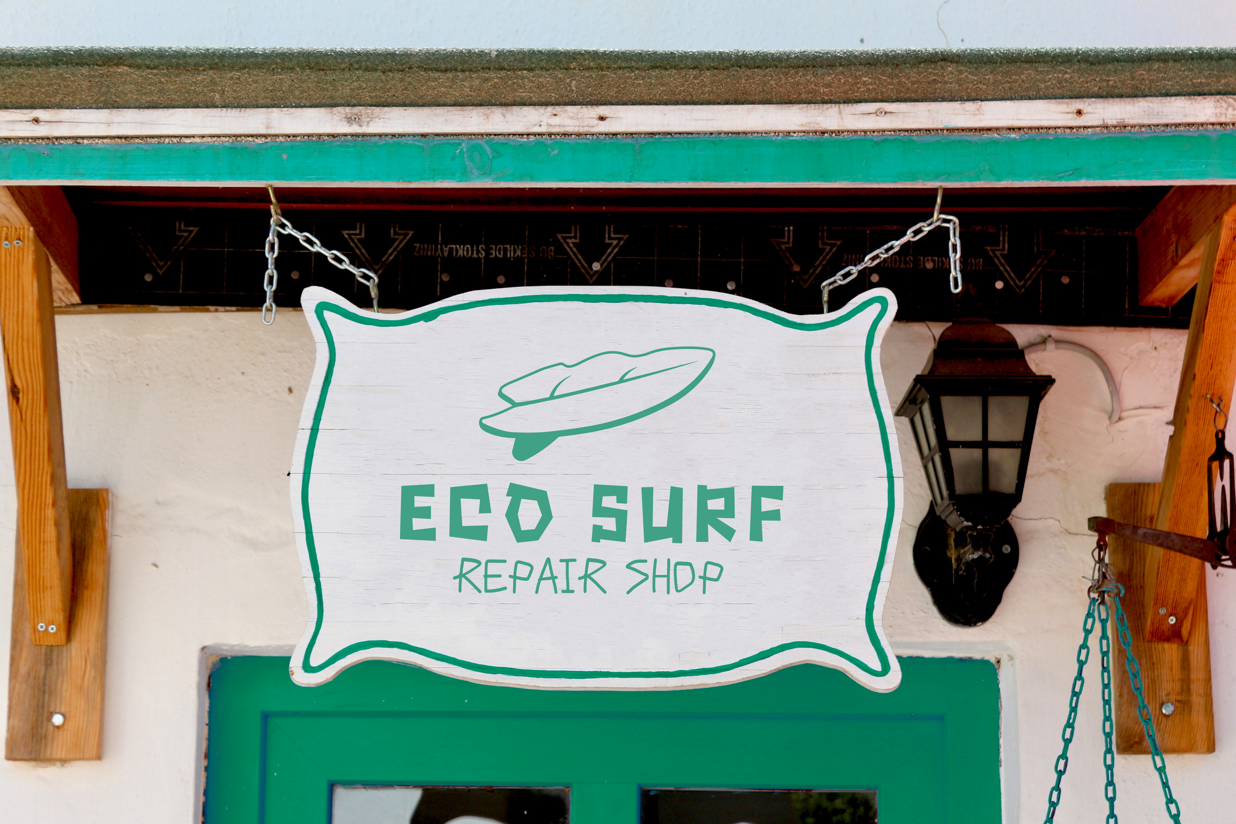
Grand Opening Mailers
Introducing the Brand to the Community
The mailer was designed as marketing collateral to announce the grand opening of Eco Surf Repair Shop and introduce the brand to the local community. The goal was to capture attention quickly while clearly communicating the opening date, location, and purpose of the shop. Vector illustrations were used to add visual interest and support the surf and sustainability themes. This piece demonstrates how illustration and layout can be used strategically to build early awareness and encourage in-person visits.

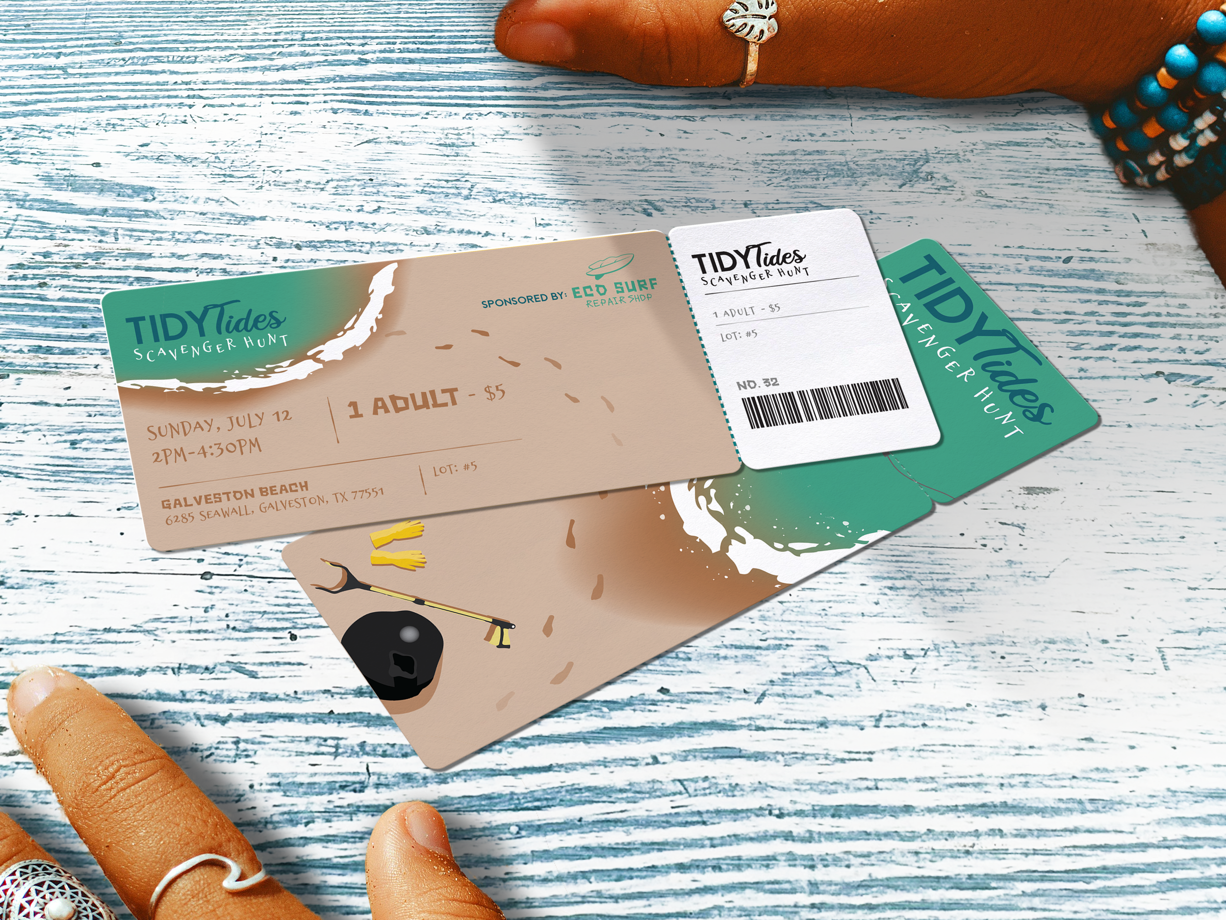
Event Poster
Promoting The Grand Opening Event
The poster serves as the primary advertising piece for the Tidy Tides event, designed to generate interest while clearly communicating essential details. Event name, date, time, location, ticket price, and sponsor are prioritized through strong typographic hierarchy. Custom vector illustrations reinforce the environmental theme while connecting visually back to the surf shop’s identity. The poster establishes the color palette, illustration style, and typography used across all event-related materials.
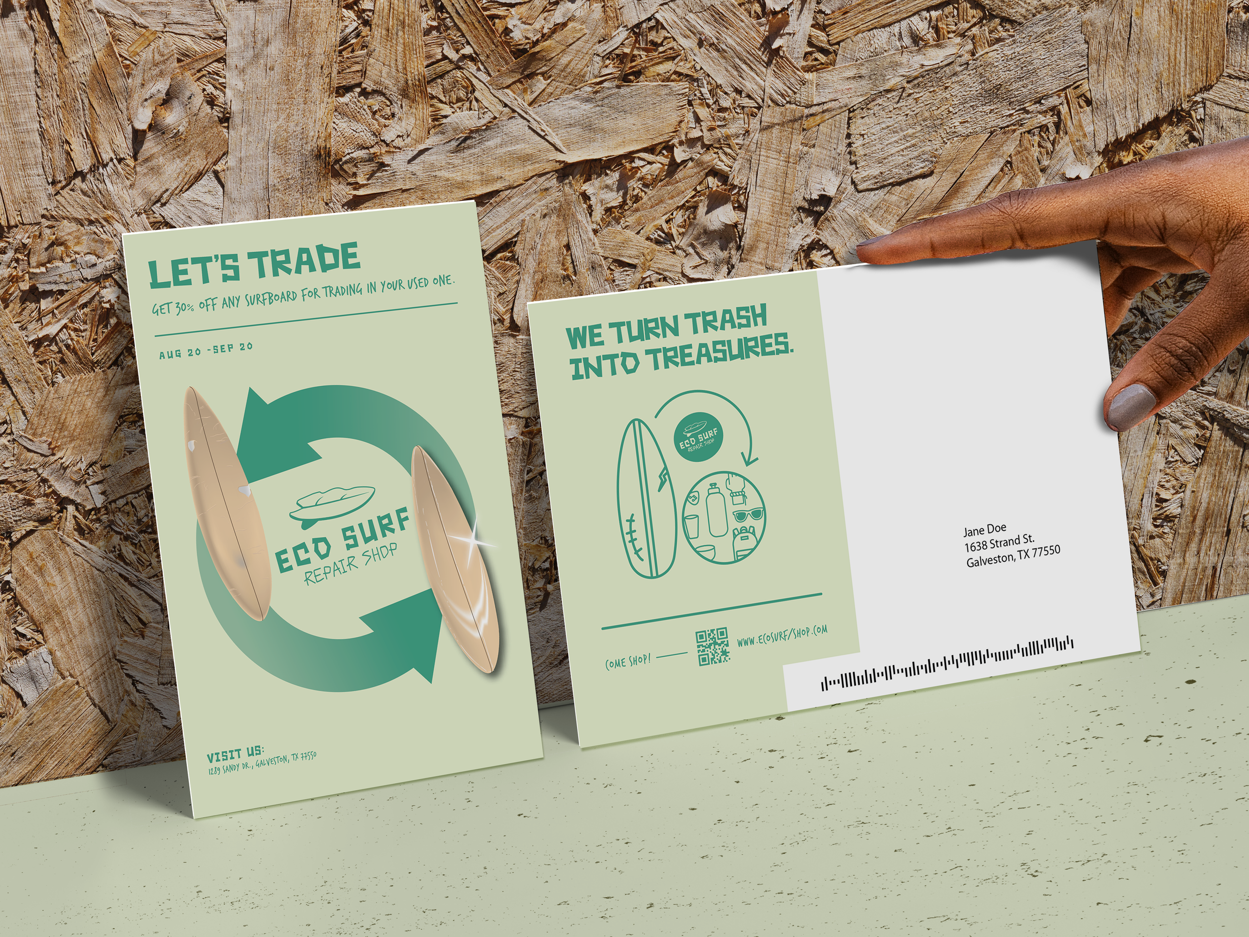
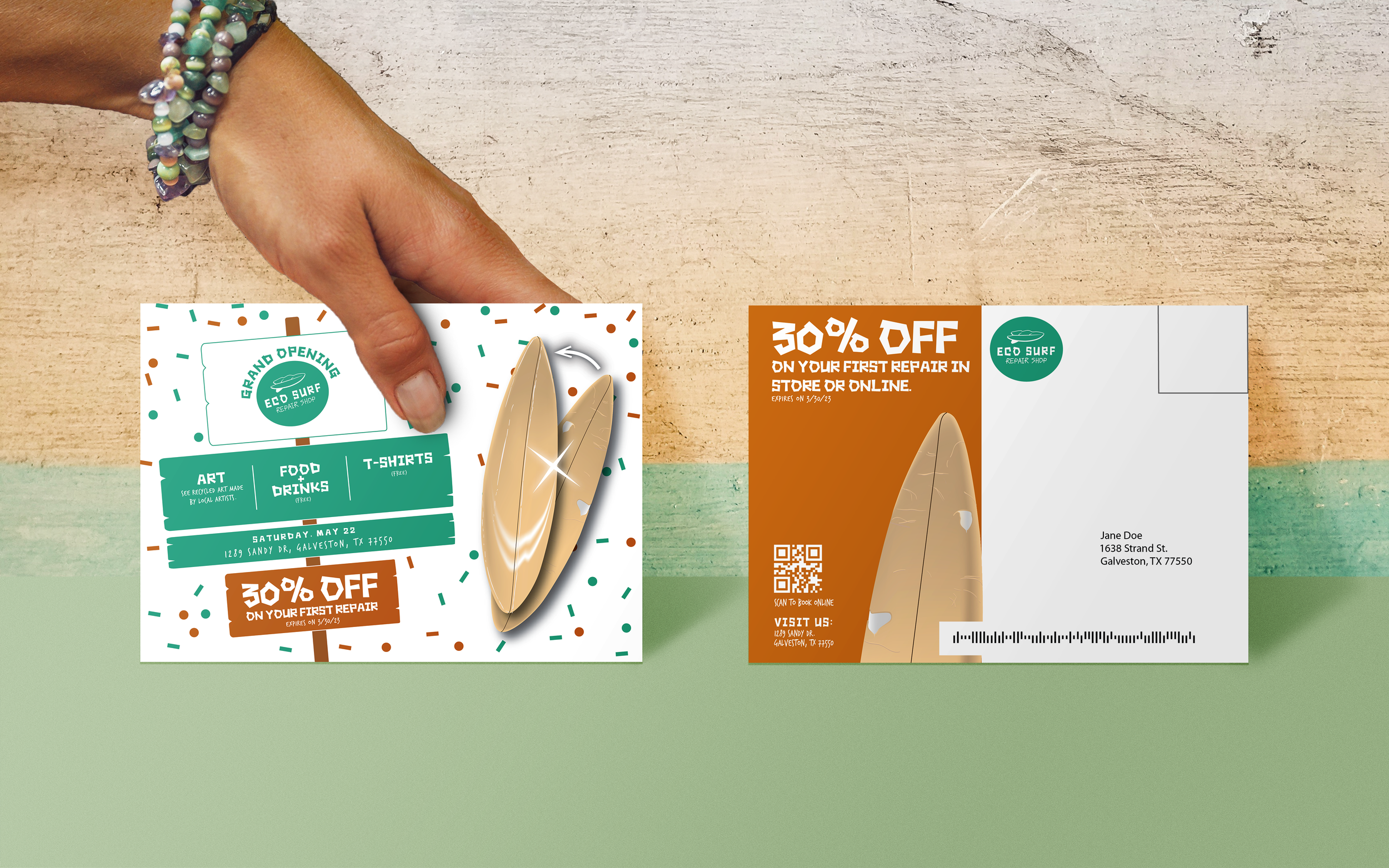
Promotional Postcards
Promoting Sales Through Advertising Collateral
The postcard series functions as advertising collateral used after the shop is established, promoting a surfboard repair and trade-in sales event. Promotional details such as dates, discounts, and conditions are communicated clearly while maintaining strong visual impact. Illustrations featuring reused surfboards and circular motifs reinforce the shop’s eco-friendly mission. Designed within a fixed format, the postcards demonstrate how illustration can elevate promotional messaging without sacrificing clarity.